This post is brought to you by… you?: Ever wanted to see your company’s product featured at the top of these posts? Now’s your chance. I’ve opened up the calendar, so book yours before they’re gone.
The pricing page may be the most important page on your site.
It’s a foundational part of the customer journey. Anyone who is seriously considering your product will visit it and make the key decision: Is what you’re offering worth the cost that you’ll charge? Are they going to shake (virtual) hands with you to pay their hard-earned cash for your services?
And yet… so many companies don’t think about this page strategically. Sometimes that’s because they’re just not paying attention. And sometimes, they’re just afraid to touch it, because they don’t want to break something that’s so important to monetization.
I recently gave a presentation at Reforge on how to approach your pricing page and I’m excited to share the insights with you: Pricing page checklist, teardowns of top companies’ pages, examples of add-on or multi-product pricing pages, metrics to track, and some homework assignments for you :)
Let’s start with the basics - Should you show your pricing on your website?
Glaring at you, B2B.
There is only one correct answer - YES.
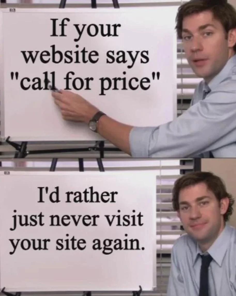
The "hide the price" tactics are coming to an end. As new generational buyers enter the market, they are less interested in traditional sales methods. People want transparency. If you think you can get Gen Z into three meetings before telling them the price, you are sadly mistaken.
As more self-serve, bottom-up competitors emerge, customers who shop around simply won’t want to talk to you unless they know how much you’re charging and what they’ll receive.
Now… this is usually reaction from sales:
They want to maintain control and customize their pricing entirely. That's how it has always been done! But here’s the thing: there’s significant value in displaying prices on your site. It can actually be your competitive edge—it's that easy to differentiate yourself in B2B nowadays (how sad is that?).
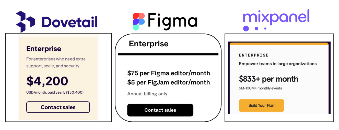
Some companies are already doing it… props to them and their trust-building ways:
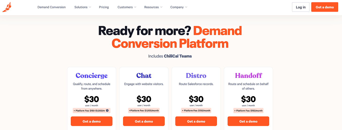
Also hats off to Chilipiper - they take enterprise transparency to the next level, look at this beauty across every sales-led product they offer:
Okay, so, now that we agree that you should share your pricing…
What does a GOOD pricing page actually look like?
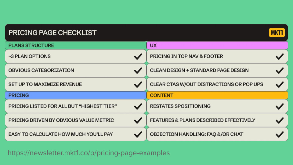
Emily Kramer created a wonderful pricing page checklist in her MKT1 Newsletter about pricing pages.
Follow everything on that checklist, but I’ll call out a few things:
Pricing driven by an obvious value metric that is clearly stated in the ‘summary’ table. People have very short attention spans! You have 5 seconds with your potential customer. If they don’t understand it in that amount of time, you’ve lost them.
Easy to understand how much you’ll pay. What do you charge for and what units does it use to scale pricing? Showcase your main value metrics (check out Reforge module on this in my Monetization course)
Feature-based is easy for customers to understand, as they pay for specific features. However, it may not offer the best monetization value because it often doesn't align with customer outcomes or usage, leading to customers paying and not necessarily using => higher churn rates. Features are great though to create differentiation between plans based on complexity.
Usage-based aligns better with customer usage; for example, Slack charges per active user, while Amplitude charges based on monthly trackable users or events. However, this model can be harder for customers to grasp since they may not know how much they will use the product. Despite this, the market is moving toward usage-based pricing to better align with customer outcomes.
Outcome-based monetizes based on successful outcomes and is commonly used in marketplaces, like Airbnb, which charges a percentage of successful bookings. However, not all products can effectively capture outcomes. For example, charging a percentage of increased productivity is.. impossible. Outcome-based pricing is the most aligned with customer needs but may not suit every product.
Pricing is always in the main navigation. If you expect me to go search for your pricing on Google, you have a major Ick from me.
Clean design. Don’t reinvent the wheel on this one! I know your designer may come in and say, ‘Oh My Gosh, I have this revolutionary design’ … Don’t do it. Just close your eyes and think about the pricing page. You know what it looks like. There’s no need to reinvent the wheel. So, let’s follow the same structure—you can put bells and whistles on it, but leave the structure alone.
Please—please!—no pop-ups. This is not the time to get a newsletter signup. Chat pop-up may be okay, but test into it.
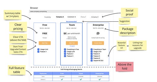
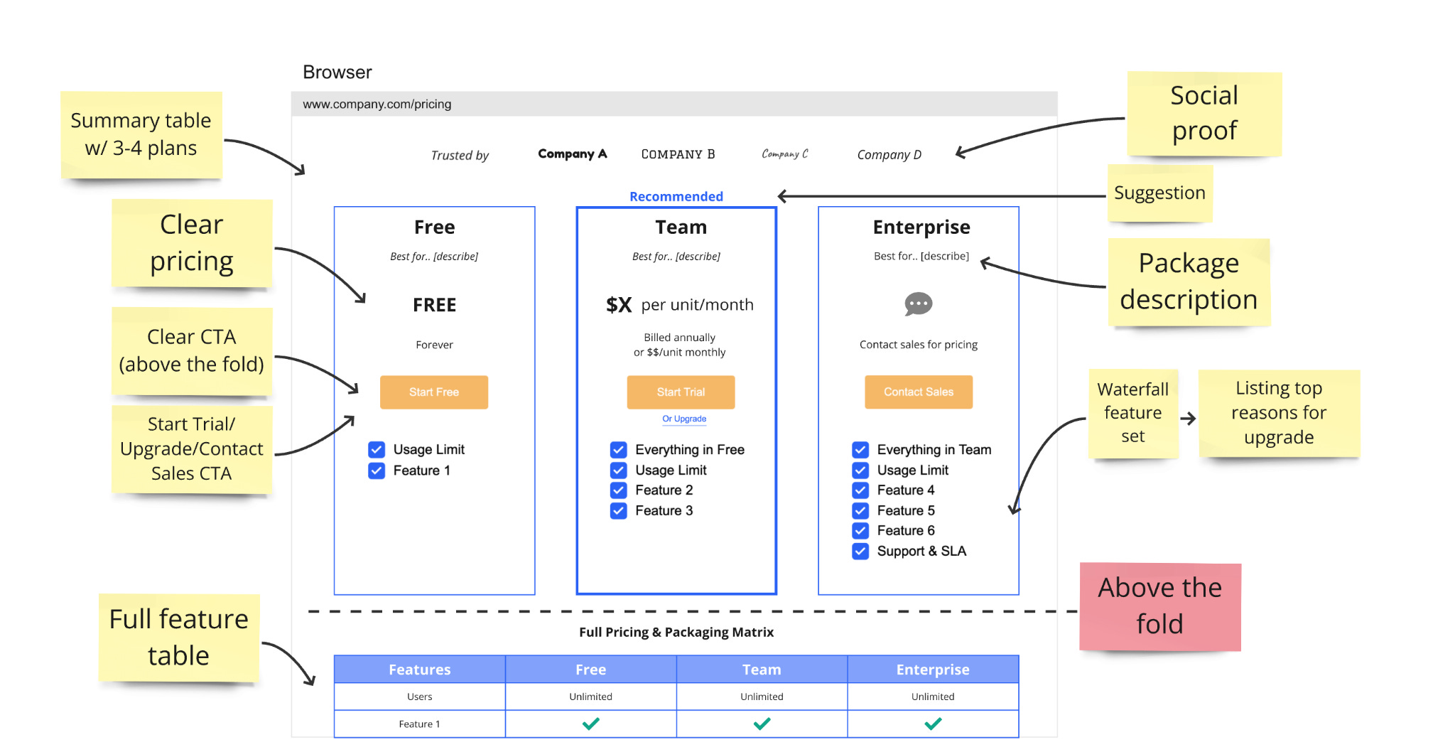
Skelton of a good pricing page that performs:
Let’s go part by part:
3 plans is ideal, 5 plans is the max. Never more than 5 - it increases cognitive load and leads to drop in conversion.
Don’t list all of your features up top. Have a summary table—just the most important stuff that your customers will care about. Definitely feel free to include your full feature list, but just put it beneath the fold.
Clear pricing. This is the reason people are on this page. Make it obvious.
Clear CTA—Above the fold. Say it with me: Above. The. Fold. This is not a landing page with a splashy hero and header. Don’t do that! This is a transactional page. And again: Simple copy, rather than trying to be clever.
Social proof to help visitors know they’re not alone.
A suggested plan. My one Ick for this is putting a ‘Most Popular’ tag on the highest-price plan… let’s not lie here! But, you can say ‘Recommended’ or ‘Best value.’
Package description. This is what Emily from MKT1 described as restating your positioning. Add a blurb of who this is for.
Waterfall your features: Through 20 years in Growth and all my testing, I’ve seen that this cascading waterfall feature list generally works best. This allows people to see that the highest-level plan is loaded with the most stuff. Make sure the features are actually valuable… but this is a great way to make it easy for the page visitors to see how the value goes up with the price.
Teardown time!
How are companies doing with these?
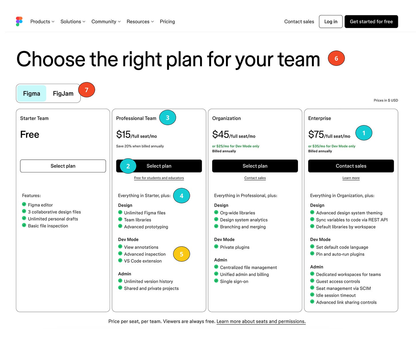
Figma
Grade: B+
Transparent & clear pricing per seat - all the way to the enterprise plan! ✅
Clear CTA’s above the fold ✅
Clear cascade of Good-Better-Best plan names showing that each plan increases in complexity (Starter → Professional → Organization → Enterprise) ✅
Cascading feature set ✅
Feature groupings/layout is confusing to understand. I’d recommend waterfall structure more (we will see this later with other companies) 🟡
Wasted space… Why? Just pull up the pricing table instead.. ❌
Tabs don’t perform well. Ever ever. Nobody will click into the other tab… so don’t expect this to be a point of discovery. ❌
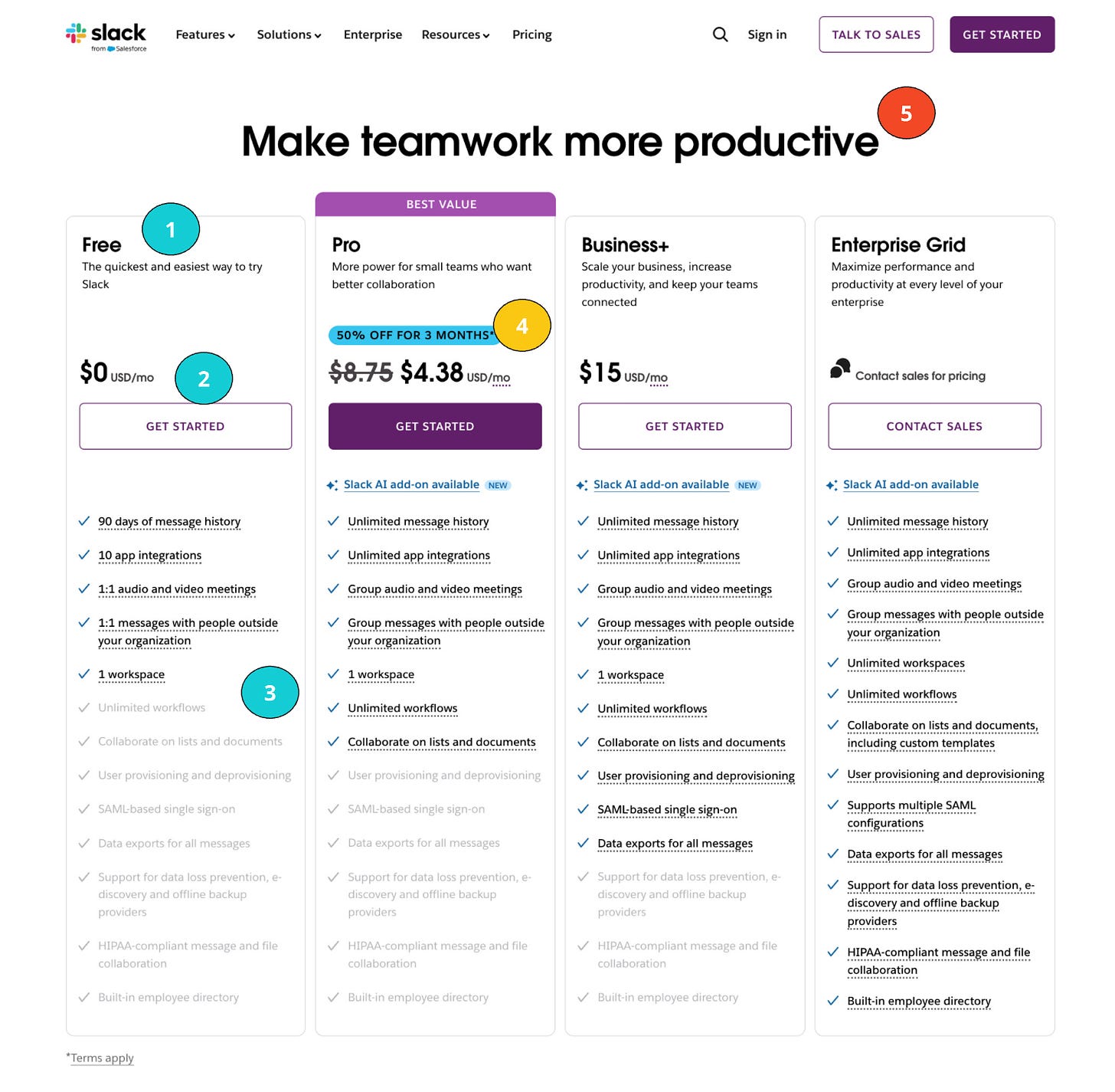
Slack
Grade: A-
Clear cascade of Good-Better-Best plan names showing that each plan increases in complexity (Free → Pro → Business+ → Enterprise) ✅
CTA’s are clear & above the fold ✅
Great waterfall-like visualization of the differences between plans + each feature has a tooltip! ✅
Unclear value metric - price should say ‘$ X per active user’ … I guess everyone knows that Slack charges per user so they can get away with it. 🟡
Wasted space… again! why or why? What is huge ‘make teamwork more productive’ does to this page? Nothing. ❌
P.S. Not loving ‘best value’ wrapper. Free is the best value after all, am I right or am I right? ❌
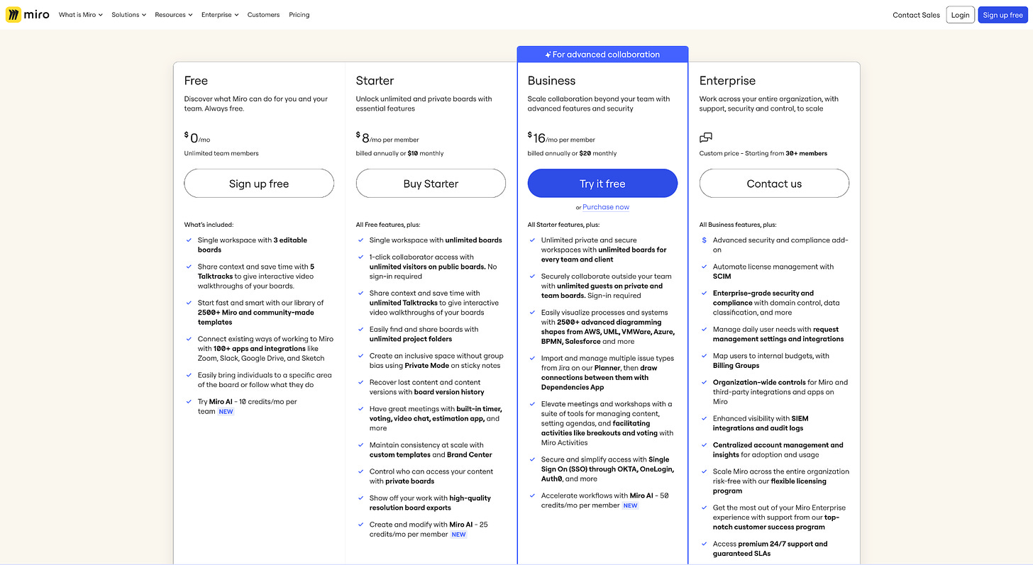
Miro
Grade: C
I used to love this page… but, not so much now - too heavy with words. Nobody has time to read through all of that! Although they do have a few positives:
Clear Good-Better-Best plan names (Free → Starter → Business → Enterprise) ✅
CTA’s are clear and above the fold ✅
No wasted space at the top of the page ✅
Unit of value is clear ✅
Good blurbs to describe who the plan is for ✅
Good ‘recommended’ blue wrapper around Business plan ✅
What about add-ons? Where do they fit in?
Including every feature in your plan may not be beneficial for everyone. In fact, doing so could deter potential customers and lead to higher churn rates. Why? Because customers may feel they are overpaying. This concept is a bit counterintuitive: while you might think you're being generous by including a lot of features—thinking, “I’m giving them all this for free! How great is that?”—your users might feel quite the opposite. They may think, “I’m only using 1 out of the 10 features in this plan, but I’m paying full price. Perhaps I should look for a solution that better fits my needs.” As a result, they might choose to purchase from a competitor offering a more tailored package.
Offering add-ons are a great way to solve the problem. My rule of thumb is this: if a feature is used by less than 30% of customers on a given plan, consider converting that feature into an add-on.
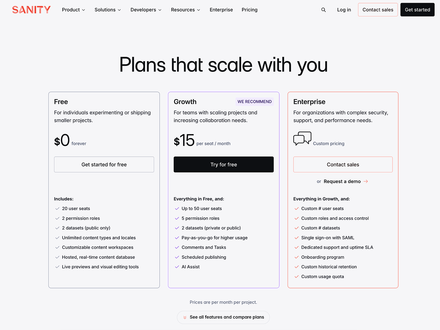
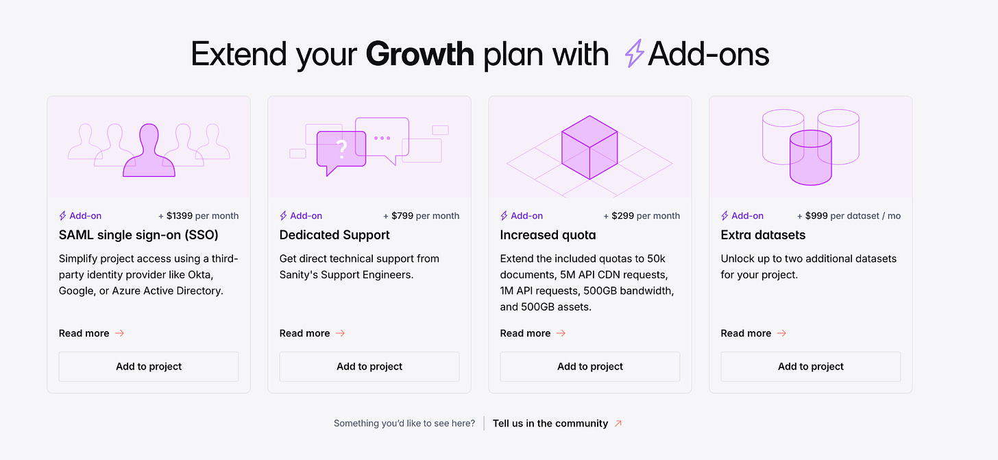
So, how do you feature your add-ons? I love how Sanity does this
Super clear main pricing section, and then BAM:
Beautifully done!
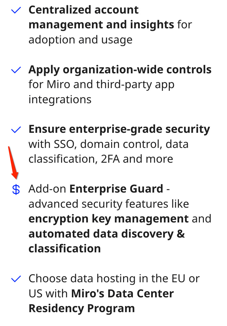
Miro does it differently - the little $! Instead of a check mark in the pricing table itself, this allows you to show the add-on, right on the pricing page.
How to showcase multi-product?
Developing pricing pages for multi-product companies is incredibly challenging—arguably one of the hardest tasks you can tackle.
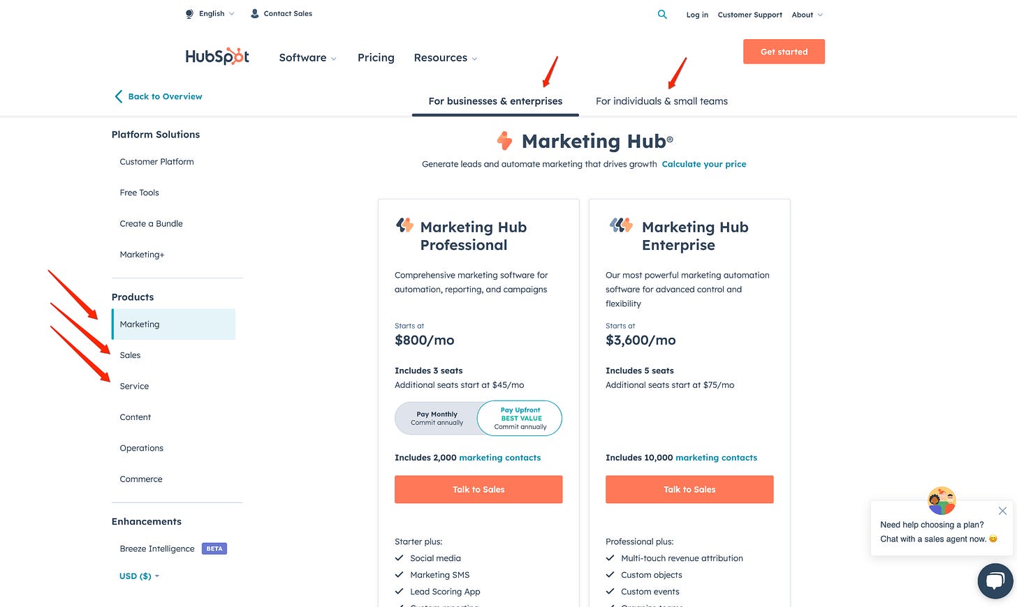
Ideally, you should create a pricing structure that presents your entire platform offering in a single lineup. However, if you have distinct products, like HubSpot’s Marketing and CRM products, multi-product may be necessary and the only way to deal with it is.. dreaded tabs. The downside is that people often won’t discover your other products through tabs. To drive traffic and exposure to those other products and tabs, consider using SEO, cross-linking, or product integration. Essentially, tabs may not get clicked; customers tend to focus on what’s immediately in front of them.
Here is how some companies do it:
Zoom
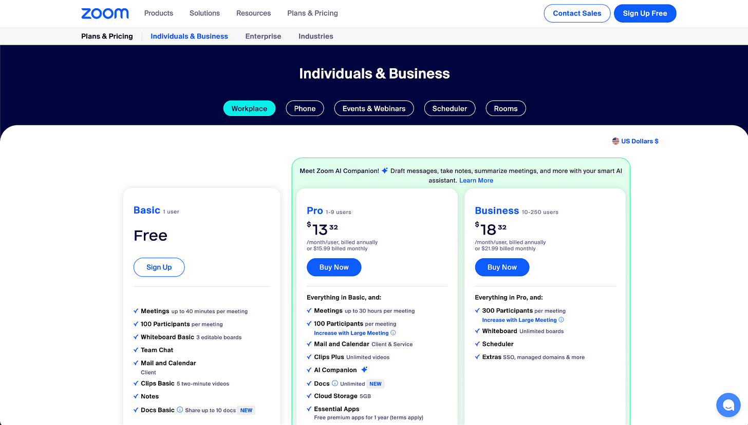
They showcase multi-product via tabs: Workplace, Phone, Events & Webinars, Scheduler, Rooms - all leading to different pricing pages. But again: This pricing page won’t be creating discovery and entry point to those other products. It is more of a hub of the pricing pages. Most of their other product are sold via sales anyway, so it’s a formality.
The point is: Don’t expect your multi-product pricing page to solve your multi-product awareness problem.
Hubspot
Tabs across the top and selector options down the side? That’s just too much. I wouldn’t recommend having tabs going every which way. However, since this is primarily a sales-driven product, this pricing page can serve an educational purpose and handle more complexity compared to a self-serve offering. Still, it’s commendable to show clear pricing even for products that require talking to sales.
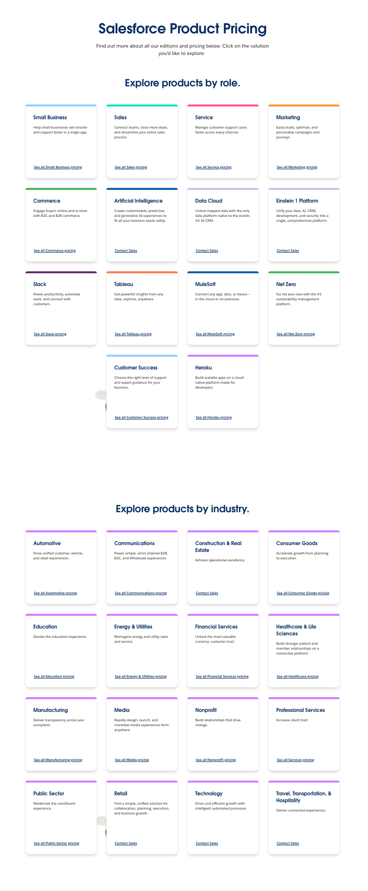
And then there is… Salesforce
Salesforce, I love you. I love to hate you too. We all know you are the master of multi-product, but your pricing page needs major help…. A million of colorful boxes, anyone?
Clearly, this is a good examples of what not to do. But again: Self-serve is a very small portion of Salesforce’s strategy and revenue capture. Most of their business is done through sales. Because of that, they can afford to do more complicated self-serve experiences, because they don’t expect a bunch of customers to actually make a lot of decisions on their website.
Metrics to track
I’ve worked at or advised 50+ B2B companies—all with PLG/Self-Serve motion. So these are metrics that I see very consistently throughout those businesses.
Awareness
Measuring your monetization model awareness is a must. Start by looking at % of sign ups visiting pricing page (benchmark for freemiums: 25%).
Conversion
Pricing-to-checkout conversion (benchmark for self-serve in-app rates: 25%)
Make sure to measure on the unique visitor level, as different models create different *need* to visit the pricing page before converting. Here are some examples:
You monetize your product based on features. For example, at SurveyMonkey, most customers paid to get access features like adding a survey logo, skip logic, or randomized choices. They might visit the pricing page initially for one feature but often decide it’s not enough to pay. However, each return visit for additional features increases the likelihood of conversion. On average, customers visited the pricing page five times before deciding, hitting feature walls each time. This highlighted the need to track this metric based on unique visitors rather than total visits.
You monetize your product based on usage. For instance, Amplitude: Most customers upgrade when they hit their usage threshold of how many events they’re sending to the platform. Same for Dropbox: They hit their storage limit. That’s why they’re converting. So, Amplitude and Dropbox expect a lot fewer visits to the pricing page and unique visitor nearly equals total visitors.
Checkout-to-order (benchmark for self-serve in-app rates: 50%)
This one is pretty universal: You have to see at least 50% or more of your checkout visitors converting to paid customers or something is wrong with your pricing funnel. If you’re seeing a lot lower on your checkout, check for payment failures or availability of the right currencies, or the right timing: for instance, in Brazil, everything works on installments, instead of annual plans. Or, in Europe, if you don’t offer any wallets, that’s also going to reduce the user’s ability to check out.
Free-to-paid conversion rates
Freemium: 3-5%
Reverse Trial or Trial: 10-15%
I’m team freemium all the way, but with reverse trials on top! They’re a wonderful way to show people the paid functionality, right from the beginning, so they don’t have to opt into any of the trials. This leads to a much higher conversion rate… and you can still revert them back to Freemium, if they choose not to convert.
Other KPIs: Pricing Page visits per user, pricing page visit sources, new vs. existing users visiting pricing page, conversion by upgrade trigger, payment success rate
Drive traffic to your pricing page
And don’t forget to create traffic for your pricing page!
I have a quick homework assignment for you: export your pricing feature list into a Google Sheet or Excel file, and put a checkmark next to every feature for which you actually have a contextual upsell in your product. I bet you’ll find several features that don’t have upsells, especially those in your Enterprise plan. For instance, you might not be showcasing SSO, compliance, or the professional onboarding services that come with your Enterprise plan.
Remember, it’s crucial to drive awareness, and the best way to do this is by including contextual upsells within the product. This is essential for helping users understand what they’re actually being charged for. One of the worst mistakes I see companies make—it's shocking to me!—is designing a paid feature, placing it in the paid plan, and then failing to consider how to showcase it or raise awareness in the lower-tier plans.
Test it!
Remember: It is extremely detrimental to you to not optimize and test your monetization model and pricing pages.
If you haven’t tested anything within a year, you’re certainly falling behind the market.
Because not AB testing is still testing, just on the 100% of your population and without quantifiable results.
Other helpful reads:
Have questions about how to structure/price your plans? Check out Monetization and Pricing course from Reforge, created by yours truly.
Learn more about Freemium in my blog post ‘What the Freemium!?’
Read about reverse trial examples in my blog here.
Or just explore different trial configurations.
Finally, don’t forget to use monetization color in your app.
Want to sponsor a post? See my pricing.
Edited with the help of Jonathan Yagel, Assistant to the Regional Memeger.




I loved the break down! Also Salesforce image hurt my eyes, especially reading it in bed lol
Great writing Elena. Exactly at this moment we are working on releasing pricing for Automatio AI.